
What is a Call to Action (CTA) and Why It Matters in Marketing?
Key Takeaways
- A Call to Action(CTA) is a strategic tool that invites users to engage in meaningful actions. That’s what makes it such an essential element for meeting your marketing objectives.
- CTAs can take many forms – buttons, text links, images, or a pop-up. Each type is designed to optimize for various content and user experience.
- Great CTAs—like those you’ll find in CTA examples above—use powerful, active language and short, punchy copy to create instant clarity and push users to complete an action right away.
- When you personalize CTAs to match the audience’s interests, preferences and behavior, you’ll see a higher engagement and conversion rate.
- Smart design tactics make CTAs pop and stand out no matter where they’re located. Contrasting colors, whitespace, and mobile responsiveness are just a few ways to do this.
- In short, regular A/B testing and performance analysis should be standard practice to hone CTA strategies over time, and ensure you’re always improving marketing outcomes.

A call to action is an important element of compelling communications, whether for fundraising, advocacy, education, or even artistic pursuits. It cuts through the noise, building trust and urgency, motivating the target audience to take action — action that delivers the results that matter.
Well thought out CTAs move the needle. They make the experience feel purposeful, from the first time you land on their website to the first time you sign up for their service. They are crafted to be very short, very action-oriented, and very topical, so that they really tap into something the audience is curious about or cares about.
With an emphasis on clarity and value, a call to action can help strengthen communication and make it more effective and goal-oriented. It’s not just about grabbing eyeballs — it’s about generating tangible results with smart, clear copy that connects.
What is a Call to Action
Definition of a Call to Action
A call to action is a strategic marketing tool designed to move users closer to a specific action. It serves as a creative visual or written cue that utilizes scarcity and urgency to prompt immediate response, whether that’s clicking a button, signing a form, or making a purchase decision. Effective CTAs can drive user engagement and influence consumer behavior significantly.
CTAs come in various forms and do not need to be elaborate. They can be clickable buttons, hyperlinked text, or even a straightforward line of text formatted in a compelling way. For example, a “Sign Up Now” button on a landing page or a “Learn More” link in an email acts as a direct guide for potential customers.
The wording of a call to action is crucial. Avoiding jargon or technical language is essential. Clear and simple instructions eliminate confusion about what specific actions the user needs to take. Thus, “Download the Free Guide Now” is far more effective than a generic phrase like “Click Here.”
This clarity is vital in cutting through distractions, especially when competing for attention in crowded digital marketing channels.
Purpose of a Call to Action

CTAs are the lynchpin in achieving conversions from users. Their ultimate aim is to drive users to take action, be it signing up for a newsletter or finalizing a purchase. By providing obvious follow-ups, CTAs simplify the buyer’s journey.
For instance, on an e-commerce website, a “Buy Now” button removes any guesswork, taking users straight to the checkout page. In marketing campaigns, CTAs are the most effective when they’re specific and aligned with the overall campaign goals.
Whether you’re putting it in social media ads, emails, or blog posts, a clear and effective CTA will make it obvious to your audience how they can take action. Including a CTA button on your article templates can increase conversions up to 83%. This is a testament to how much control they have over user choice.
How CTAs Influence User Behavior
A strong call to action (CTA) will significantly increase click-throughs and conversions. Well-designed CTAs are expertly crafted using psychological triggers like urgency or exclusivity to push users to take specific actions. Phrases like “Limited Time Offer” or “Only 3 Left” tap into a user’s fear of missing out, prompting immediate responses.
Clear concise CTAs reduce the chance of confusion too. They minimize confusion by clearly showing what we want our audience to do. The best-performing CTA in our test got 49 conversions for $5.10 a piece.
In contrast, the worst-performing CTA garnered only 20 conversions at an average cost of $12.50 each. This highlights how minor changes in language or design can lead to vastly different outcomes in an ad campaign.
Relevance matters greatly. CTAs that are personalized to your audience and the stage of the customer journey they’re in work best. For instance, the “Start Free Trial” button appeals to users who are just browsing, while “Upgrade Now” targets those who are ready to take the plunge.
Types of Calls to Action

A call to action (CTA) is any element that encourages users to take a specific action, such as clicking a powerful CTA button or responding to compelling calls. There are many different kinds, each designed to effectively serve various marketing campaigns, ensuring the action aligns with your marketing goals.
Button-Based CTAs
Tons look great—clear, visually striking, and eye-catching all at the same time. They’re the most powerful, just ask Copyblogger, where button CTAs helped increase conversion rates by 45%.
Examples include:
- Buy Now
- Get Started
- Subscribe Today
Their call to action friendly, urgent tone makes you want to click right now. For example, “Get access” is better for exclusive offers that make users feel special.
To maximize button effectiveness, think about your product’s greatest benefit and the action you want your users to take.
Text-Based CTAs
Text CTAs are super versatile and work really well in any format. They are great for nudging users in the right direction without causing cognitive overload.
Examples include:
- Learn More
- Join Our Newsletter
- Download the Guide
While “Learn More” is relatively effective throughout the funnel, it works best in the beginning of the sales funnel, establishing a low-pressure entry point.
Short, simple language increases interaction by cutting out the fluff and getting to the point.
Image-Based CTAs
Images combined with strong copy can create powerful emotional responses and calls to action.
Examples include:
- Shop Now with a product image
- Watch Our Video with a play button overlay
- Explore More with creative visuals
That’s because this format cuts through the noise. The perfect image CTAs look more inviting and relatable when accompanied by the right image.
Pop-Up CTAs
Pop-ups are great for grabbing attention at opportune times.
Examples include:
- Sign Up for 10% Off
- Join Our Webinar
- Get Your Free Trial
Pop-ups can be annoying if used excessively, but at the right time and place, they work wonders. Email conversions, for example, can jump up to 15% when combined with high-converting pop-ups.
How to Write Effective CTAs
Use Strong and Clear Verbs
Using strong verbs in CTAs creates urgency and encourages user action. Words such as “Download,” “Subscribe,” and “Shop” are incredibly effective because they are simple, specific, and command an action.
For example, a CTA to “Subscribe now to get updates every week!” lets visitors know exactly what they will receive. The verb has to align with the action you want them to take. If you’re looking for them to buy, “Buy,” “Order,” or “Get” are good options.
These action-focused verbs introduce a level of urgency, motivating users to make a move.
Evoke Emotion or Excitement
Emotional CTAs create a bond with the audience by targeting emotions. Excitement can be a strong motivator for faster action too.
A CTA such as “Don’t wait—take advantage of our exclusive offers now” creates urgency and excitement. Just like “Start your journey to better health” makes the reader feel good.
Emotionally Charged CTAs are effective because they illustrate the benefits that focus on what users care about.
Keep Messages Concise and Direct

Keeping it short helps users understand what you want them to do instantly. Short and sweet CTAs such as “Shop now” or “Call today” minimize cognitive load, simplifying the decision-making process.
Too much information can overwhelm and confuse users. Go for clear and specific over cute or clever.
A simple, direct message is as powerful as a STOP sign, slowing people down right away.
Tailor CTAs to Your Audience
Understanding your audience is fundamental. CTAs that are personalized, and further, based on analytics and testing, increase engagement.
For example, understanding how visitors use the site allows for tailoring content such as “Find personalized offers.” Personalized CTAs address the user’s specific needs or pain points, increasing click-through rates and conversions.
Best Practices for Creating CTAs
1. Focus on User Intent
This is why understanding user intent is so important when designing CTAs. It begins with understanding what your users need at each step of their journey. For example, a new visitor still checking out their options might react more positively to “Learn More” instead of “Buy Now.
CTAs need to be in alignment with these motivations and move the user to the absolute next logical step. When you approach CTAs from the perspective of users’ behavior and goals, you’ll design CTAs that work without feeling like a used car salesman.
Keep placement in-mind as well. Your eCommerce product page could use a call-to-action to get a free trial. A newsletter signup just makes sense on a blog.
Determine what your users are looking for and tailor your CTAs to what they’re expecting to get the most engagement.
2. Make Design Visually Appealing
The design of your CTA is just as important in seizing attention. Use whitespace to make buttons or links pop, while not making the page feel cluttered. Things such as bold typefaces, negative space, or gentle movement can all draw the eye to your CTA.
Graphics and icons, used judiciously, tend to enhance both aesthetic and readability as well.
3. Ensure Mobile Responsiveness
With more than half of all content consumed today on phones, mobile-friendly CTAs aren’t just recommended, they’re essential. Tons need to be simple to tap, text clear, and layouts fluid.
Don’t just test on desktop—ensure your CTAs are attention-grabbing on every screen.
4. Test Placement for Higher Visibility
Smart placement of clickable CTA buttons makes all the difference to conversions. A powerful CTA that’s above-the-fold will likely grab more clicks than one hidden at the bottom of a page. A/B test positions such as headers, sidebars, or mid-content to determine what captivates your audience’s attention most effectively.
5. Use Contrasting Colors for Buttons
Selecting colors that will pop against the rest of the page background is one of the best ways to draw the user’s attention. For example, a bright orange button on a white page would provide immediate contrast that stands out.
Colors can help with this, too—drawing the eye to red for urgency, for example, or using blue to convey trust.
6. Add Urgency or Time Sensitivity
Phrases such as “Limited Time Offer” or “Ends Tonight” serve as powerful calls to action, adding urgency and a fear of missing out that prompts potential customers to act now. This marketing term effectively encourages users to take specific actions sooner rather than later.
7. Include Value-Oriented Language

An effective CTA focuses on what’s in it for the user. Instead of “Submit,” use “Get Your Free E-book.” Words such as “Save,” “Discover,” or “Claim” (depending on what you offer) provide additional context and interest.
Don’t use ambiguous wording, tell users exactly what they’re getting.
Importance of CTAs in Marketing
CTA elements are small potatoes, but one of those elements that are incredibly important. They are the connector between generating top-of-funnel awareness and inspiring true conversion. Sign up for our newsletter, download our eBook, or buy something!
A concise, compelling call to action will direct them to take action immediately. Without one, users will likely leave your site empty handed, having completed their task. For example, a simple “Sign Up Today” at the end of a blog post can guide readers toward deeper engagement with your brand.
Driving Conversions and Sales
CTAs are closely linked to increasing sales and revenue by guiding the user to act right away. In fact, research from our friends over at Hubspot found that personalized CTAs perform 202% better than generic CTAs, making their potential impact even more remarkable.
In that sense, a CTA placed well, like on an ad headline, allows users to easily scan content leading to higher CTR (click-through rate). A clothing company can get noticed if they are running ads using “Shop the Sale.” This fun phrase takes users straight to the sale products!
A/B testing different call-to-action styles and placements helps you discover what works best for your audience. Most importantly, this method ensures continued optimization in your strategy.
Guiding Users Through the Funnel
CTAs help you move users from one stage of the marketing funnel to the next, which is why they’re so important. Use action-oriented CTAs such as “Learn More” during the consideration stage to welcome customers to your products or services.
At the purchase stage, make it easy to make a decision with “Add to Cart.” By strategically placing CTAs at each stage of the decision-making process, you’ll guide their navigation seamlessly.
For instance, a fitness app could employ the CTA “Start Your Free Trial” in the consideration stage. This strategy works great to gently push users to take a commitment. Adding more than one CTA at times can provide users with flexible choices, making their experience better overall.
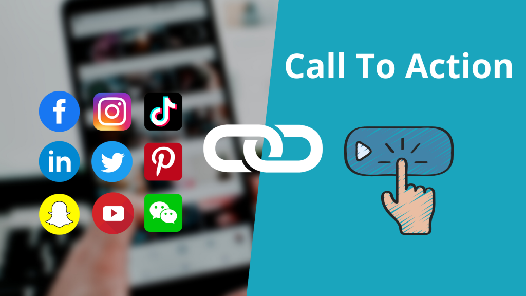
Enhancing Engagement Across Platforms
CTAs are one of the most flexible tools available for improving engagement on social media, email, and websites. Or on Instagram, their “Swipe Up to Shop” CTA increases click-throughs.
Emails that include the words “Claim Your Discount” create a feeling of urgency. Adapting CTAs for different channels is crucial. What works on a website might not work on Twitter.
CTAs encourage community engagement and loyalty. CTAs that ask people to “Join the Conversation” or “Follow Us for News and Updates” encourage further action. Each CTA creates a relationship, cultivating familiarity with your brand.
Role of A/B Testing for CTAs
A/B testing is critical to optimizing the effectiveness of your call-to-action (CTA) elements. By testing different variations against each other, marketers can find out what users respond to and make decisions based on real data. Over the past 10 years, sophisticated analytics technology has brought this approach within reach.
These tools provide a proven path for developing CTAs that really connect with people.
Benefits of Testing CTA Variations
A/B testing CTA variations gives marketers the freedom to experiment with various designs, messages, and placements to find out what drives the best results. For example, changing the button color from blue to green or tweaking the wording from “Sign Up” to “Join Now” can reveal intriguing patterns in user behavior.
Sometimes these seemingly small changes can result in big increases in overall engagement and conversion rates. Routine testing reveals your best CTAs and ensures your approach remains innovative and agile.
If you have a very well-tested CTA, you may be pleased to get a 2% click-through rate, and that can double the performance of your website.
Analyzing Performance Metrics
Tracking key performance indicators (KPIs) is crucial to optimizing CTAs. Metrics such as click-through rates, bounce rates, and conversions give specific insight into what is working and what isn’t.
Analytics tools make this easier than ever by providing you with actionable insights. For example, a simple test may show that mobile-friendly CTAs lead to much higher engagement.
This validates the case for dynamic content optimization across each and every device.
Improving Conversion Rates With Data
Using data is the best way to make sure that your CTA strategies are in tune with user behavior and preferences. By knowing which elements such as button size, placement, and wording impact their effectiveness, marketers can A/B test their CTAs to perfection.
A successful A/B test can result in a significant 40.6% boost in sign-ups. That’s the magic of data-driven decision making.
Ongoing optimization, driven by data, ensures CTAs remain effective and compelling.
Examples of Effective CTAs
Website-Based CTA Examples
Website CTAs should always meet user intent, need to be straightforward and actionable. Here are some examples:
- This CTA works well for services like software or streaming platforms. It reduces the barriers to commitment and encourages discovery.
- "Get Your Free Quote": Found on service-oriented sites, it empowers users to gather cost estimates without pressure.
- Commonly used by forums or membership sites, this builds community and a feeling of exclusivity.
The secret to the effectiveness of these CTAs is their simplicity and relevance. For example, Hotjar’s “Sign Up” CTA on its homepage is clearly aimed at visitors who know they’re in the market for analytics tools.
Likewise, Chipotle’s “Order Now” button is perfectly tailored to the hungry user, converting hungry lookers to buyers in just seconds. Aligning CTAs with their overall context makes for more natural user experiences and ultimately more conversions.
Social Media CTA Examples
Effective CTAs on these platforms encourage engagement:
- This keeps users connected with your brand.
- "Share Your Thoughts Below": Encourages comments, fostering conversation.
- Drives social sharing, expanding reach.
What is important is to tailor CTAs to each platform’s dynamics. Instagram is a platform where strong visual CTAs can shine, and Twitter works well with short, punchy, and enticing phrases.
When done thoughtfully, these CTAs can develop community and increase brand awareness.
Email Marketing CTA Examples
Email CTAs should motivate immediate responses. Examples include:
- "Claim Your Discount Now": Creates urgency to drive sales.
- Boosts traffic by promoting valuable content.
- "Join Our Exclusive Webinar": Engages users with educational opportunities.
This is where personalization really sets effective CTAs apart. Research has found that personalized CTAs perform 42% better than untargeted CTAs, and using clear, action-oriented language is a great way to guarantee more click-throughs.
Red CTA buttons, for example, can increase conversions by an additional 21%.
Conclusion
A compelling call to action has the potential to stop the show. A clear, concise, and attractive CTA will lead your audience, capture interest, and inspire action. Increase your sales, expand your email list, and drive more engagement. A specific, measurable and achievable call to action will ensure we all stay on track! Minor adjustments, such as experimenting with wording or button colours, can lead to significant impacts.
Begin with attention to your audience’s needs and stick to a clear, simple message. Whatever it is, be specific about what you are asking them to do. Speak their language and inspire them to take action. Through practice and experimentation, you’ll discover the right approach that aligns with your goals.
Take action today—don’t let these amazing opportunities pass you by. Jump into your next campaign and see the energy of CTAs in action. We think the findings will surprise you.
Frequently Asked Questions
What is a call to action (CTA)?
A call to action (CTA) serves as a powerful marketing term that directs your users towards specific actions you want them to take. Common examples include “Sign Up,” “Learn More,” or “Buy Now” buttons. These compelling CTAs guide visitors effectively, making them critical to successful marketing campaigns and website best practices.
Why are CTAs important in marketing?
CTAs, or calls to action, help steer your audience toward specific actions, whether that’s completing a purchase or signing up for a newsletter. These powerful calls enhance user engagement, build leads, and grow sales, making them essential for any organization’s marketing goals.
What are the types of CTAs?
Common types of action buttons include buttons, links, banners, pop-ups, and in-content phrases. Effective call-to-actions can be customized around different objectives such as lead generation, social sharing, and directing potential customers to sales.
How can I write an effective CTA?
Write for real people, not technocrats, using compelling calls that engage your audience and demonstrate how your offerings help them. Avoid generic CTAs like 'Get Your Free Trial' and 'Save 20% Today'; instead, focus on crafting clear CTA buttons that resonate with your target market.
What are some best practices for creating CTAs?
Create compelling CTAs that stand out by using colors that contrast with your design, and ensure they are placed above the fold. Additionally, make them mobile-friendly and A/B test various calls to determine what works best for your audience.
Why is A/B testing important for CTAs?
A/B testing allows you to test side-by-side different designs, texts, or placements of your action buttons. It helps you understand what works best for your marketing campaign, leading to better click-through rates and more conversions as time goes on.
Can you provide examples of effective CTAs?
Examples include:
- "Start Your Free Trial Today"
- "Download the Guide Now"
- Each is unambiguous, call-to-action focused, and provides immediate value to the user.